My search for a radial WiFi plotting tool was unsuccessful, so a coded my own: wsrradial.py.
It’s easy to record activity in the 2.400–2.500 GHz ISM spectrum with a Wi-Spy adapter and a directional antenna. Here’s my 9 dBi Yagi antenna:

One low-tech way to quantify the electromagnetic radiation around you goes like this: point the Yagi antenna in one direction for 1 minute, then turn it 45° and repeat the procedure, until you’ve completed a full circle. Use wsrradial to generate radial plots of the recording made with Chanalyzer. It’s configured by default for 8 measurements (360° divided by 45°) of 1 minute each, but command-line options allow you to choose your own parameters.
The following radial plot shows the average amplitude for each sampled frequency. The frequency is set out on the radial axis (the lowest frequency is closest to the center, the highest is the most distant), the angular coordinate is just the orientation of the directional antenna. Amplitude is hue color-coded.
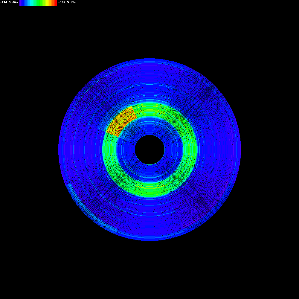
This was recorded a couple of meters away from an active access point operating at 2.432 GHz. You can clearly see that the access point is situated in the upper-left corner.
The second plot generated by wsrradial shows the maximum amplitude instead of the average amplitude. I believe this plot gives a better picture of nearby transmitters.

I tried to use matplotlib to generate the charts, but was only able to generate the same charts Chanalyzer produces. So I coded my own chart plotting routines with the Python Image Library. If you know how to use matplotlib to make radial spectrum plots, let me know.
FYI: my latest little puzzle showed an average amplitude plot of the same recording, but with an older version of my program featuring an easier to code color map.